

Writeboard app
The Challenge
In this increasingly digital environment, using a pencil and paper when learning is far from obsolete. Popular edtech apps have yet to bring handwriting and drawing into the live online classroom in an accessible way for students and educators alike.
So, how do we integrate drawn communication into the live online classroom in a way that adds value to students and educators?
Team
Nabila Hisbaron: UX designer; researcher
Responsibilities
UX research | Persona-building | HMW | Storyboarding | Click tests | Wireflows | Branding | UX Writing | Prototyping | Usability testing
Duration
2 weeks; May - June 2021
The Solution
Writeboard is a mobile edtech app that is crafted to harness the value of handwriting and drawing in live online classes. It’s designed to optimize the portability of one’s mobile device and existing writing tools such as paper and pen. By making this more accessible for students and educators, it brings the ‘learning-by-doing’ method back into the digital learning experience.

Listening in
There were two target users in mind: students and educators. Within my three-week scope, students were the main focus for this sprint while educators were considered until the ideation phase.
The overarching goal of this research was to see if and how drawn communication is valued in order to design a drawn communication experience in the virtual classroom.
The competitor analysis looked at edtech software, productivity and video conferencing tools with integrated drawing tools that are often used to host virtual classrooms.

From the analysis, it became clear that creating an experience that is free and accessible to students and educators will be a competitive advantage. Handwriting digitally can become messy and cumbersome, so this issue should be considered during ideation.
User interviews
A total of six participants shared their experiences with drawn communication in the classroom, both in-person and online. They all have experience with transferring to remote learning and have come across and/or administered drawn communication during live online classes.
Students: two high school students and one university freshman were interviewed.
Educators: one language teacher, one high school chemistry teacher, and one geography lecturer were interviewed

The interviews revealed that university students may experience better virtual handwriting due to more resources readily available to university faculty. This surprising insight steered my user focus to grade school students and educators, middle to high school students, who would greatly benefit from a free handwriting app.
Surprising student insights include:
Goals: handwriting/drawings are used to visualize complex ideas, see teachers’ thought-process
Needs: teachers’ virtual handwriting must be clear and legible. Students also need to write down good notes in order to learn successfully.
Pain points: alongside technical hiccups, students find that the monotony and decreased interaction with teachers are stifling their learning experience.
Surprising teacher insights include:
Goals: delivering engaging lessons to their students
Needs: quick and easy teaching set up that can be put together swiftly in-between classes/meetings
Pain points: not being able to 'read the room' to gather quick student feedback. The classroom feels cold and one-sided.
What makes a great class?
Meet Karla
Research insights helped me to craft a user persona. Meet Karla – a 16-year-old high school student from Singapore. Since remote learning, she feels a huge burden to teach herself the learning material. She needs to see her teachers’ drawings to help her visualize complex ideas and to include them in her notes.

To address Karla’s needs, we ask ourselves…
How might we assist Karla to see her teachers' thought-process drawn out in order for her to write good notes?
Karla’s learning journey
To better illustrate various emotional peaks and pits of Karla’s live online classes, a storyboard journey was created. It used insights gathered from both student and teacher interviews.
Using insights from the user research, the Writeboard app can offer positive feelings of optimism, confidence, and control throughout the user journey.

Generating ideas
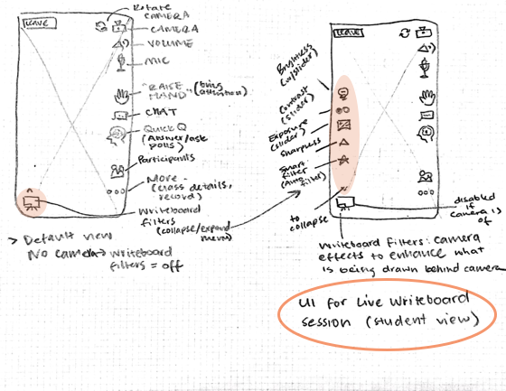
Sharing hand-drawn work in a live online classroom
User research revealed that the classroom whiteboard was used both by teachers and students to work out problems in front of the class. This promoted classroom engagement. However, remote learning has reduced ‘virtual whiteboards’ to be used only by teachers. Two-way drawing in live online classrooms are very rare – and when it does happen, it is sloppy and cumbersome due to the lack of digital handwriting tools.
Keeping this friction in mind, the features in consideration include:
Utilizing familiar drawing methods and tools, like pencil to paper, as the “whiteboard” subject;
Using the mobile camera as “eyes” for students/teachers to see the work written on the “whiteboard”;
Making video filters available that can enhance the view of the “whiteboard”, such as contrast, brightness, and sharpness; and
Providing standard video calling features such as volume, mic, camera (and switch), and chat.

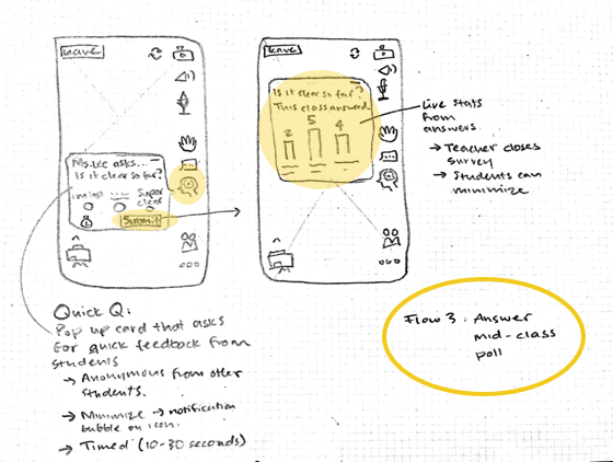
In order for teachers to ‘read the room’ during live online classes, teachers can make short polls in which they can gather quick student feedback. This is designed to assist teachers when they cannot see or hear how their students are responding to the lesson.
To address students’ need to write good notes, all classes will be recorded. This, along with documents shared during the live class, will be shared to the live class attendees. This setting can be turned off in the teacher’s account settings.

Validating the Appmap
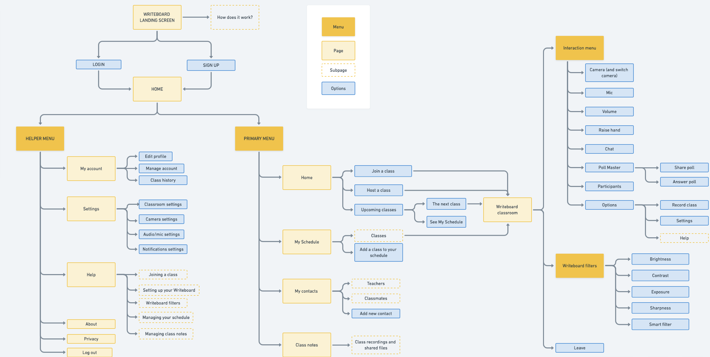
A click test was created using wireframes in order to test the information architecture of the app. 10 participants responded to tasks regarding the flow and navigation. There was >80% success rate with all tasks. The click test helped inform the app map.
Designing the look and feel
The brand identity of Writeboard was heavily informed by the emotional needs of our users identified in the storyboard journey. The brand is designed to support students become creative, courageous, and community-driven.
Considering the brand identity, the look-and-feel of the app was crafted to be both vibrant yet approachable for students. Iterations of the brand identity were tested and validated on the prototype by student users in order to reach the finalised brand style tile.

Prototyping
In this phase, the wireframes were elevated by implementing the brand elements - which included both visual components and microcopy.


Getting feedback
Using the prototype, four flows were designed to test the flow, navigation, and interaction details of the Writeboard app:
Attending a scheduled class – to test navigation
Sharing your hand-written work during a live class session – to test flow and interaction details
Giving feedback to the teacher by responding to a poll – to understand use cases
Download class notes – to test flow and navigation
Usability testing
Three high school students, ranging from ages 16-18, participated in usability testing online and in-person. They have prior experience with transferring to remote learning. They also have come across and/or administered drawn communication in live online classes.

Prioritizing revisions
To decide which pain-points to prioritize for the final designs of this sprint, I used a decision matrix with the axes User impact vs. Efforts (to execute). A high user impact means that it would either impact lots of users, allow users to accomplish their tasks easier - or both. High effort assumes that the overall flows would need to be reconsidered.

From the usability tests, high-impact opportunities for this sprint include:
Make the Writeboard filter icon more clear, straightforward
Allow students to re-visit poll results in live classes
Indicate what app screen they’re on while they’re navigating through the app


What’s next
Second usability testing of these design revisions would help me validate whether I have eased the friction in the flows.
In the following sprints, I would like to do more research that tasks students to physically demonstrate how they would set up their Writeboard space. These insights can generate a content strategy that supports students with tips on how to set up their Writeboard space at home.
Furthermore, I would like to follow through on a sprint centered on the teachers’ goals and needs. The insights gathered from the students’ experience with the app can help inform the design decisions of the teacher-facing app.
Reflections
This app addressed both the physical space (writing on paper) as much as the digital space (the app). The physical positioning of the mobile device to showcase the writing process had to be considered. This was a new challenge for me as the success of the app is dependent on both the physical and digital experience. I look forward to further research to tackle this challenge – it will give me an opportunity to explore the physical opportunities of the Writeboard experience.
Check out another project >>

The Curl Code
Crafting a beauty e-commerce site designed to guide customers to use the best products and methods to help them feel their best (Dutch).