

Outreach website redesign
The challenge
The University of Bristol’s Admissions team needed to promote Outreach activities in order to encourage more applications from school students of underrepresented backgrounds and reach application targets. However, the Outreach website is a disjointed section of the prospective student user journey and has not had a content revision nor redesign in several years. Moreover, we were missing user insight to improve the overall user experience of this website. This would be the first “website section” to use components from our new design system.
Team
UX designer (me), UX researcher, UI designer, Content designer, Product manager, Delivery manager, Admissions team (stakeholders)
Responsibilities
User research strategy, problem framing, conducting un/moderated research, workshop facilitation, stakeholder management
Duration
2 months (2024)
The Solution
To increase the value of the Outreach website, we prioritised information aimed at school students in the content hierarchy while deprioritising content for teachers and industry peers. Summer programmes and offer eligibility were brought closer to the user journey. Terminology was also rewritten in lay terms and more consistent throughout the University website.
“Exploring the wild, wild west”

The old design (late 2023).
Our stakeholders suggested that teachers were the primary user group, citing that they enable students to apply to university, particularly children who are first in their family to attend university or have extenuating circumstances. School students were secondary users. Due to time constraints, we started by focusing on school teachers.
A significant challenge was that there was no user insight prior to this project. Our team called this challenge “the wild, wild west” - not much data to work with initially, but lots of opportunities to set UX foundations. Thus, one of the outcomes of this project was to equip the Admissions team with a holistic set of user insights about teachers interacting with their online services.
To do so, a mix of quantitative, qualitative, generative, and validation methods were planned.
The preliminary research goal became: we want to know how teachers and counselors enable students to apply to University so that we can redesign the Outreach pages that support their work.
(Spoilers: this research goal was later scrapped to get to the real problem!)
How are users behaving on the website?
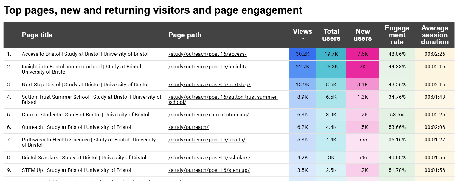
With a Content Designer, we dove into the analytics of the current Outreach pages using Looker Studio. This was done to learn more about existing user behavior of the past 12 months. On the most viewed pages, we also used Heatmaps to better understand how users were interacting with the content. Some key findings included:
7 out of the 10 most high traffic pages were Summer school programmes, or “Post-16 activities”.
Very low traffic to teachers pages and documents than expected
The low traffic to webpages and documents targeted at teachers made me speculate about whether teachers were in fact the primary users of this Outreach website.
Our competitors are doing things differently
The UX team conducted a competitor analysis of our top five direct competitors.
Taking directions from the quantitative study, the objectives were 1) to see how our competitors designed for their Outreach website, 2) comparing user journeys of finding “post-16 activities”, and 3) their use of terminology.
In this analysis, key findings included:
Use of the term “Outreach” was more popular than “Widening Participation” to describe this admissions process
Outreach resources and activities were brought closer to the typical application user journey; instead of keeping Outreach content distinctly separate in another section (decentralised), users can find content about Post-16 activities, “contextual” and “guaranteed” offers directly on the course pages themselves
A couple competitors offered an “eligibility tool” feature, an interactive quiz to help school students see what Outreach offerings they’re eligible for
It became clear that other universities designed Outreach webpages with students in mind as their primary user - contrary to our own priorities.
Reconsidering the primary user
During our internal SME focus groups, we learned that programme managers work closely with school teachers through emails, mailing lists, and phone calls. They seldom link them through to the Outreach website.
This partly explains why the teacher pages on the Outreach website were getting low traffic - teachers were not depending on the website for admissions information!
We made a call to pivot our focus onto school students, challenging our stakeholders to reconsider who the primary users of the Outreach website are.
We quickly revised our research plan and decided to interview Outreach ambassador students to prove our point: school students from underrepresented backgrounds are more likely to depend on our Outreach website than school teachers are.
Mapping out mental models
To assess how our users associate and group Outreach topics, we conducted an open unmoderated card sorting activity. We collected keywords and topics using what we learned from the analytics report and our SME interviews. This was distributed to teachers as well as our Outreach student ambassadors (50-50 makeup in total responses).

The dendrogram gave us valuable insight into how we might group the pages in the redesign.
Listening in
Interviews were organised with six Outreach student ambassadors. The research goal was to learn what students from underrepresented backgrounds value when browsing universities so that we can redesign the Outreach pages that enable them to apply confidently.

The interviews were done remotely over MS Teams. A script was designed to cover the following objectives:
Understand how they browse universities to apply to
Identify what information and content they look for when browsing
Understand the barriers that they face when applying to universities
Understand how they decide which universities to attend
Evaluate the content hierarchy and navigation of the redesigned Outreach page
Key learnings that were majority sentiments included:
Frustrations:
I am confused - I don't even know what to look for! I don't know what all these uni terms mean
I am overwhelmed - I don't get practical support from my parents as I’m the first in my family to go to uni, and my teachers only help me w/UCAS deadlines
I am anxious about money - how do people afford housing?
Needs:
I need to find ways that I can strengthen my uni application to make sure that I get into university
I need to do well in my exams to get the grades that I need for university
I need to get funding so that I can go to uni and not go broke
Using this discovery phase, the learnings were turned to multiple outputs to humanise the design process and prioritise our solutions.
Humanising our design process
Meet Serena
Research insights helped me to craft a user persona. Meet Serena - a state school student proactively applying to an undergraduate course.

To address Serena’s needs, we ask ourselves…
How might we help school students find what Outreach opportunities they are eligible for given that they feel overwhelmed by university and its application process?
Serena’s application journey
Information about Outreach offerings and activities need to be better incorporated into the prospective user journey and cannot remain exclusively decentralised. This as-is user journey map illustrates when and where we can anticipate user needs.

Imagining the “possible self” through storyboarding
Access to Outreach opportunities can offer positive feelings of confidence, excitement, and hope of realising the potential self.

Designing solutions
Design critique before development
Using the discovery insights, I worked together with a Content Designer to put together a high fidelity prototype using our new design system components.
Then I facilitated a hybrid design crit where the desktop and mobile landing page designs were presented back to the stakeholders, Outreach managers and the enquiries team to collect feedback.
All feedback was categorised into either “corrections” or “opportunities” to prioritise development. Key improvements include:
Stop using “Outreach” and “Widening participation” as interchangeable words. Rewrite internal language in lay terms.
Include student information for estranged students and care leavers
Prioritising “Contextual offers” above “Guaranteed offers” due to size of eligible audiences.
Deprioritise “Student stories” in the content hierarchy to better surface task-based information
Improving the overall user journey
A Content Designer conducted a content audit on the prioritised pages, identified during discovery. Below is an example of a redesigned priority page: “Post-16 activities”. The goal was to improve content hierarchy, page assets, accessibility within the text and alt texts, and readability.
On the previous design (below, left):
Key information in the table was inaccessible, especially on mobile (44% of visitors used mobile)
Target users unclear: the page is for students, but included information for teachers
Purpose of page unclear: the page is to explore activities, but included support for Black and Asian students

On the redesign (below, right):
Replaced the table with modules for better mobile experience and readability
Moved content about teachers and student support to more appropriate pages
Page assets with students improved design look-and-feel

Other key improvements include:
Signposting to centralised information about contextual and guaranteed offers, prioritising contextual offers based on greater number of eligible applicants.
New content for estranged students and care leavers to address the need for knowing what opportunities one is eligible for. A Content Designer worked with the SME’s to communicate the right information in a user-friendly way.
With the feedback implemented, the new Outreach website was launched.

Prioritising next steps
A prioritisation matrix was created from the discovery phase and the design crit activity along the axes “User impact” vs “Effort (to execute”. This allows the stakeholders to prioritise which tasks they can take on next. This handover was presented during the project wrap up.

Reflections
Pivoting our focus from teachers to school students in the middle of our discovery phase was both valuable and stressful. In hindsight, had we scheduled the internal SME focus groups as the first research activity, we might have learned about the teachers’ preferred ways of working earlier and avoid wasting time creating a research plan revolved around them. However, we still managed to turn the research plan around in part due to insights in the analytics and competitor analysis.
We learned from the competitor analysis that some universities implemented an “Eligibility questionnaire”. Applicants can input their living situations, care status, and study interests to see whether they qualify for a contextual offer and/or are eligible for Summer programmes. Our interviews also revealed that students wanted a more personalised experience. Delivering a questionnaire feature as part of our project was not possible due to time constraints. I would have liked to prototype this feature in the following iteration of this product to explore the desirability and usability with the users. This might alleviate the anxiety from users that they “do not know if they have a chance of getting into uni”.
Check out another project >>

The Curl Code
Crafting a beauty e-commerce site designed to guide customers to use the best products and methods to help them feel their best (Dutch).